During some of my presentations, I get asked about the work environment for editing digital photographs. I also get individual inquiries about the subject. In this post, I will address those questions with some photo editing workspace examples including my own.
Vision, the perception of luminance, and color are generally relative. If you want to validate this to yourself try going from bright outdoors directly to your basement or another reasonably dark place. As you enter the basement you will notice that it is quite dark and you may even have difficulty seeing what is around you.
Now, sit and wait for five minutes, and observe how things become reasonably easy to recognize with good detail. The same thing is true for color, not only do some colors interact with each other and make us perceive them differently, but bright and strong colors will tend to make others look more muted than they actually are. This emphasizes the importance of your photo editing workspace.
General Photo Editing Workspace
If we carry this line of thinking, the surroundings of your computer monitor, the level of light around it, the color of the wall behind it, etc. all become players in your digital photo editing process; all unbeknown to you! Here are general guidelines for a comfortable and accurate digital workflow. I asked my friends Jim and Frank to provide photographs of their workspace which they designed after consulting with me.
- You must, MUST, start with a calibrated and profiled monitor. Without this step, you are not even fishing in murky waters, you are trying to fish in the desert. A calibrated and profiled monitor will display the colors accurately and reflect the correct luminance levels. Your monitor calibration may even be incomplete!
- Do not have your monitor sitting in front of a window which may allow you to “enjoy the flowers in the backyard.” Go out to the garden to enjoy your flowers but place your monitor away from the windows. The amount of light behind it and the colors you will see from the window will seriously distort your perception of what you see on your display monitor. Those flowers are not part of your photo editing workspace.
- Paint your walls neutral gray if you can, at least avoid strong colors. My walls are slightly cool gray, they have almost a green tinge. Frank chose a cleaner gray, which is better. Jim’s walls are darker gray which works extremely well. If you have to paint the walls with strong colors, try to put black foam core boards, or something similar, behind the monitor covering most of your direct vision behind the display monitor.
- If there are windows to the side or above your monitor, use window blinds to sufficiently darken them and shield the light from the window so that it does not hit the screen. That will tend to weaken the colors which will result in excessive adjustments to your images.
- Make sure there is no strong light source behind you that may similarly illuminate the display and distort the perception.
- A display hood is a very good idea. I made one a while back but due to my excellent craftsmanship, it did not last long!! You will see in one of the photographs how Jim shields extraneous lights from hitting his monitor.
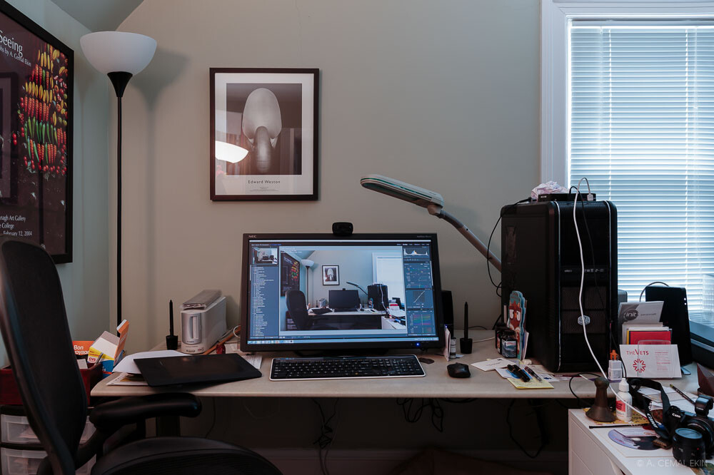
- Try to maintain a similar ambient light. I realize this may be difficult from daytime to nighttime, but with a carefully placed lamp, you may provide sufficient ambient light without disturbing the display. See the tall light behind my monitor which I turn on at night time. It is behind the display, not too strong, and is reflected from the ceiling for reasonably even lighting
- You may have other windows in the room, which should all have blinds or controllable shading. You can adjust the amount of light coming into the room depending on the outside conditions to maintain a relatively stable ambient light in the room.
- Your desk should be at the right height that allows you to sit comfortably in front of it. Speaking of sitting, a good task chair will pay its cost back with fewer back problems. You will likely sit in this chair for long hours, so why not choose a comfortable and ergonomically designed chair? I bought my Aeron chair probably more than 10 years ago, it is still in excellent shape and supports me well.
- Your tools, like keyboard, mouse, tablet, etc. should be properly positioned with sufficient room around them for easy operation.
- A few things are worth noting:
- See the placement of my computer tower to block the window light
- The reflection of a light you see on the Weston poster is from a light behind me which I turned on to shed some light on the desk, normally it is not on
- Jim’s display is very well shielded from the window behind him, yet the window adds a little extra light to the print evaluation area; note his Ottlite lamp!
- Note how Frank covered a window high above with black blinds
Printing and Print Evaluation
Aside from digital editing, printing, and print viewing environment needs to be controlled. This may even be more important than some of the issues surrounding your editing workspace since prints are viewed by reflected light and are highly susceptible to the amount and quality of light falling on them. I have had more than a few times friends complaining about poor print quality suddenly realizing that their prints suffered from a lack of proper light falling on them.
As you will see, above my Epson 4880 printer, I use an Ottlite to view my prints. Regardless of the amount of light in the room, I always review my prints under this light. This allows me to make mental comparisons to other prints I have made since they were all viewed in the same light.
In addition to the amount of light falling on the print, the color quality of the light is also very important. Not all “bright sources of light” have the correct spectrum for viewing prints. Ottlite is daylight balanced although some say it has spikes on certain frequencies of the color spectrum. It has worked well for me and I do not see perceptible differences between viewing prints under this light and good-quality sunlight.
If you don’t mind a little more expense, I have heard very good things about Solux. I believe you can buy the lights and sockets, and with a little handiwork, you can build what you need. I prefer to just plug them in! Your photo editing workspace will reflect your choices.
There is a very simple, but possibly hard-to-find, tool for determining the suitability of the light for viewing prints. I have one that I got probably 8 years ago, it is called “Kodak Color Viewing Light Selector.” Inside the folding cardboard is a small 1.75″ x 3.5″ purplish-pink patch. Miraculously, under bad lighting, say old fluorescent tubes, you see stripes on the card which indicates that the light is not suitable for viewing prints, particularly color prints although B&W prints may also be degraded depending on the toning and the color shift of the light source. I emphasize these points in the printing presentations and workshops I have.
The key to all this is “consistency and control”. We should strive to control the photo editing workspace environment to minimize, if not eliminate, the contamination of the display and the printed output, and maintain a consistent environment so that what we do becomes second nature and repeatable. Here are photographs of a few workspaces, mine and my friends. They both took my recommendations to heart and are very happy with the results.


 Preserving Mood in Photographs
Ed Haskell
Hi Cemal, useful information, as always.
Is this a new site page template or have I just suddenly noticed it? I like it.
Ed
A. Cemal Ekin
I am glad you found the post informative Ed. The theme on the site has been here for quite some time, but it is doing what it is supposed to do: pull back and push the content forward. Maybe that’s why you have not noticed it before, that’s a good thing for my Web design sensibility.
Cemal
Ramazan KAMARI
Dear Cemal;
Great writings as always. I wish you live Ankara. So I am looking for a good mentor.
Best wishes.
A. Cemal Ekin
Thank you Ramazan. We are planning to be in Turkey for a few weeks at the and of August beginning of September. Who knows, ….
Cemal
Jim turner
I love my workspace which was completed following your advice and direction. After several years using this space I wouldn’t change anything. Cemal’s law for workspace “rocks”
A. Cemal Ekin
Very good to hear that Jim. You have a very nice workspace indeed!
Cemal
Haluk Atamal
Very useful information as usual; thanks a lot Cemal.
Comparing all the examples with mine, a small wind of depression has blown past, may I say.
My rank is probably somewhere between trying to find fishing equipment in the desert and actually fishing there.
Aware of the issue, more often than not, I try to take photos not too dependent on colour shifts. This is not easy but possible at times. In any case I do suffer the agony of colour changes from monitor to monitor to prints.
I try not to care too much about it. After all I am photographing to enjoy myself, not to worry.
Thanks again, Cemal. Love and best wishes from a finally-summercome-Antalya!
A. Cemal Ekin
Oh-oh! Monitor calibration and profiling is the first step in digital workflow. A good monitor and a calibration device is a good investment. I use XRite i1 Display Pro, a middle of the road model. There are devices that will go $1,000 and more, this is a modest $200 device and does its thing well. The same company also makes a little less expensive model which works just as well, only takes a little longer.
Summer is coming here too I think, it is quite nice outside this morning. Take care,
Cemal